How Color Psychology Shapes Brand Perception
Color psychology in branding – In the competitive world of marketing, color psychology plays a crucial role in shaping how consumers perceive and connect with brands. The colors a brand chooses are not random, they carry emotional weight, cultural associations, and subtle messages that influence purchasing decisions. From the deep trust conveyed by blue to the urgency triggered by red, color is a silent yet powerful storyteller.
In this article, we’ll explore how color psychology affects brand perception, how companies can leverage it for stronger brand identity, and why the right color palette can significantly impact customer loyalty.
Understanding Color Psychology in Branding
Color psychology is the study of how different colors influence human emotions, behaviors, and decision-making. In branding, it is used to create specific emotional connections between a business and its audience. This connection is often subconscious, yet it has a lasting impact.
Research shows that up to 90% of snap judgments about products can be based on color alone. This means your choice of brand colors could determine whether someone trusts your business or moves on to a competitor.
The Emotional Impact of Different Colors
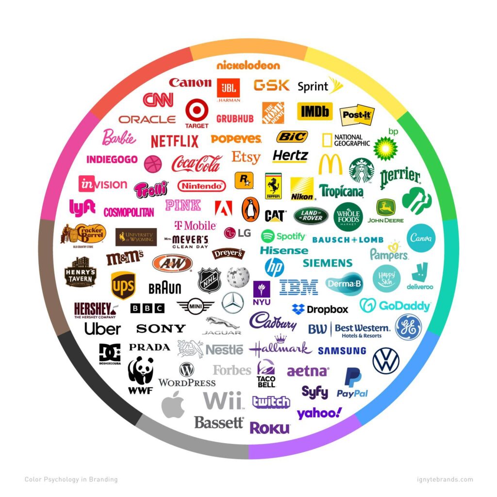
Different colors evoke different psychological responses. Below is a breakdown of common color associations in branding:
– Red – Energy, passion, urgency. Often used by fast-food chains and clearance sales to spark quick action.
– Blue – Trust, reliability, calmness. Commonly seen in financial institutions, tech companies, and healthcare brands.
– Yellow – Optimism, warmth, creativity. Used to grab attention and promote feelings of positivity.
– Green – Growth, health, nature. Popular among eco-friendly brands and wellness companies.
– Black – Luxury, sophistication, authority. Favored by high-end fashion and luxury goods brands.
– Purple – Creativity, wisdom, imagination. Often linked to premium products or brands targeting a creative audience.
– Orange – Friendliness, enthusiasm, adventure. Used to create an approachable and energetic brand image.
– White – Simplicity, purity, cleanliness. Common in minimalist branding and healthcare.
By understanding these associations, businesses can choose colors that align with their mission, values, and target audience preferences.

How Color Shapes Brand Personality
Your brand’s personality is the set of human traits you want your audience to associate with your business. Colors act as visual cues to reinforce that personality.
For example:
– A tech startup that wants to appear innovative yet reliable might choose a combination of blue and silver.
– An organic skincare brand aiming for a natural and eco-conscious identity might lean towards shades of green and earthy tones.
– A luxury jewelry brand wanting to convey prestige and elegance might use a black and gold palette.
This is why a mismatched color choice can create confusion and weaken brand recognition.
The Role of Cultural Context in Color Perception
While color psychology has universal patterns, cultural differences can shift its meaning. For instance:
– In Western cultures, white often symbolizes purity and weddings, while in some Asian cultures it is linked to mourning.
– Red is seen as a warning color in many Western contexts but represents good luck and prosperity in China.
Brands operating in global markets must consider these cultural nuances to avoid misunderstandings and maintain positive brand perception across different regions.
Case Studies: Successful Use of Color in Branding
– Coca-Cola – The vibrant red not only grabs attention but also triggers excitement and energy, aligning with the brand’s fun and refreshing image.
– Facebook – Blue promotes trust and calmness, reinforcing its position as a safe space for social connection.
– Starbucks – Green reflects relaxation and community while hinting at environmental consciousness.
These brands have achieved global recognition in part because their colors align perfectly with their brand values and messaging.
How to Choose the Right Colors for Your Brand
Selecting the right colors for your brand involves more than personal preference. Here’s a step-by-step approach:
1. Define Your Brand Personality – Are you bold and adventurous or calm and dependable?
2. Know Your Target Audience – Different age groups and cultures respond differently to colors.
3. Study Your Industry – Identify common color trends but look for ways to stand out.
4. Create a Color Palette – Choose a primary color for your brand identity and complementary colors for balance.
5. Test and Adapt – Use A/B testing in marketing materials to see which color combinations perform best.
Why Color Consistency Matters
Once you’ve chosen your brand colors, consistency is key. Using the same colors across your logo, website, packaging, and advertisements strengthens brand recognition. Over time, customers will be able to identify your brand purely from its colors just like how red and yellow instantly bring McDonald’s to mind.
Final Thoughts
Color psychology is not just about making things look pretty, it’s a strategic branding tool. The right colors can communicate your brand’s values, appeal to your ideal customers, and create an emotional bond that drives loyalty.
By understanding the psychological and cultural impact of colors, you can make informed choices that enhance your brand perception and give your business a competitive edge.
Table of Contents
Read also: Minimalist vs. Maximalist Design: Which Works for Your Brand?

